It is a bad news week for the Atlanta Hawks.
This will likely not lessen that blow or keep the franchise from succumbing to the turmoil it is currently in.
We can find one bright spot though. And we are going to celebrate it as historians of the game.
The Philips Arena court is getting back one of the great and iconic logos in NBA history as the Hawks go through a quasi-rebrand. Yes, the Pac-Man logo is back in Atlanta and it will be featured at center court this year, as Zach Lowe of Grantland reported in his unofficial rankings of NBA court designs:

The Pac is back, baby! The Hawk clutching a basketball in its claws wasn’t awful, but you just can’t beat the Pac-Man-style logo the Hawks used in their glory days. This is like the friendly Milwaukee deer spinning a basketball — a logo so well-loved, it’s unclear why the franchise ever went away from it.
The paint is a shiny red, and the absence of any lane markings just makes the red shine brighter. The thin red outlining of the white “Atlanta Hawks” emphasizes the preeminence of red with this franchise. The Hawks have always used orange-red shades, but the court mostly eliminated it for run-of-the-mill navy paint and gold trim. It was stagnant. It could have belonged to any team.
Oh, yes, the Pac-Man logo is glorious. Lowe ranked the Hawks’ new court as the ninth best in the league. He still is not crazy about the Hawks’ blue flirtation after being red for so long.
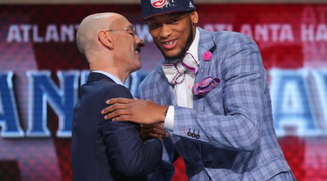
We have seen the Hawks slowly phase the Pac-Man logo back into their brand too. Their draft hat this year featured the Pac-Man logo signalling to the rest of the world that the organizational change back to the nostalgic logo was coming.
This is welcome news for NBA fans and longtime NBA fans who somewhat detested the cartoonish look of jerseys as teams rebranded themselves and went away from their traditional identities.
More nostalgic NBA fans will be thinking about going to Philips Arena now. That should make them happy, right?
Lowe’s top floor design went to the traditionals — the Celtics and Lakers. Personally, the Lakers’ court design gets docked a few points for me because of the championship stars that ring their center-court logo. It is hard to argue with the classics though. The Hawks finally learned that.