
Since the #HickoryPacers have ignited a new uniform conversation in the NBA, raising questions of taste and aesthetics across generations of basketball fans, let’s continue the exploration of uniforms and everything that goes into them.
We started this conversation on Wednesday with a look at retro and modern uniforms. The next component of our discussion concerns one specific part of a uniform: the logo of the team, which is often removed from a uniform, but still informs the color scheme and the general appearance of the uniform itself.
*
A few trends have emerged in American professional sports team uniforms over the past 25 years, since the end of the 1980s. If you are old enough to remember the 1980s, you might indeed have felt that the colors were too loud and too commonplace, creating a somewhat cartoonish feel for the events you saw on fields and courts and hockey rinks. (This, at least, is the main critique of 1980s uniforms.)
Starting in the 1990s — think in particular of the Chicago White Sox and Los Angeles Kings — the move to black and gray uniforms began. The bright swaths of color that emerged in the late 1970s and throughout the 1980s began to recede. Teams went for black, and they also went for much more intricate logos with subtler colors — shades of primary colors instead of the straight colors themselves.
Clearly, the thought process which did not warm to the identity of 1980s uniforms took root in the 1990s. It continues today with the Brooklyn Nets move to a black-and-white scheme, and it will be unearthed in a few of the examples we’re about to show below.
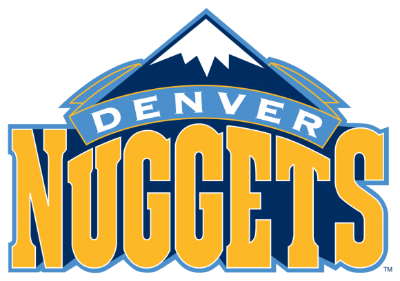
In this push-and-pull between competing visions of how uniforms and logos should look, a word must be put in for the 1980s, if only for purposes of clarification (though I am partial to the 1980s’ style myself): While perhaps too loud in its use of color, 1980s’ uniforms generally coexisted with less complicated logo designs. The Denver Nuggets’ 1980s logo is the exception that proves the rule, but even then, the colors are simple and not the kinds of colors you get after hours of looking for just the right variation at Home Depot:
![]()
The updated Nuggets’ logo is actually simpler and cleaner:
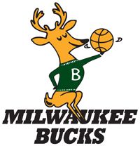
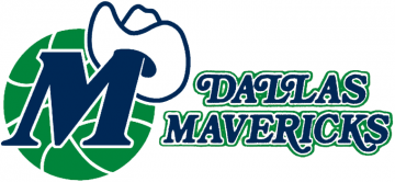
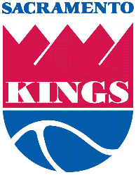
Yet, having established this as the exception, let’s move to the many examples of logos in which the 1980s featured a much simpler design with basic colors, but in solid forms without intricate and busy backgrounds:
MILWAUKEE BUCKS 1980s LOGO
MILWAUKEE BUCKS CURRENT LOGO
![]()
DALLAS MAVERICKS 1980s LOGO
DALLAS MAVERICKS CURRENT LOGO

UTAH JAZZ LOGO HISTORY — 1970s AND 1980s TO THE PRESENT DAY
![]()
KANSAS CITY / SACRAMENTO KINGS 1980s LOGO
SACRAMENTO KINGS CURRENT LOGO

One question to take with you at the end of this piece is simply this: Intricate logos — usually more commonplace today, relative to the 1980s — do represent a certain heightened level of art. However, of all the places and contexts in which to behold art, does a professional sports team’s branding and clothing represent a good use and display of artistic complexity?
Wednesday, in our discussion of throwback uniforms, we mentioned the New York Yankees’ baseball uniforms; the Dallas Cowboys’ football uniforms; and the Montreal Canadiens’ hockey sweaters as examples of simple uniforms that did not need to be changed. A similar tension point exists for logos. The current team logos mentioned above (save the Nuggets’) are far more intricate than their 1980s predecessors. Purely as a visual object, the current logos might be more impressive. As a part of a uniform, and also a basketball court with a color scheme, do those current logos make you want to buy more apparel or souvenirs?
There’s no wrong answer, but the question is certainly worth thinking about.