
Presented with minimal commentary, here are the 10 worst uniforms in NBA history. The challenge was not to rank any of these rank uniforms in the back half of the top 10 (or bottom 10, as it were). So many of these uniforms look like top-3 contenders. How can one separate one piece of trash from another?
This is what we’re here for in the NBA offseason.
*
10 – HOUSTON ROCKETS LATE 1990s: ROAD

This is a cartoon, at least the Rocket in the heart of the logo. This is also not the last cartoonish jersey you’ll see on the list. Notice, too, the thick and loud pinstripes — they are always meant to be thin and crisp, the opposite of this.
9 – ORLANDO MAGIC 1990s: ROAD
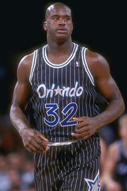
More loud pinstripes. The numbering could not be more garish or ostentatious. Uniforms exist to blend in with the form of the athlete, playing a beautiful game on a playing surface that is pleasant to behold. To be fair to the Magic, their color scheme never lent itself to a good uniform. Still, these are something close to pajamas on basketball players.
8 – DETROIT PISTONS 1990s: ROAD
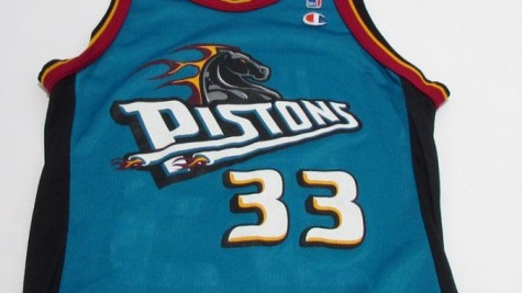
Grant Hill, such a classically elegant basketball player, had to wear this. Such a shame. There is a cartoonish feel to the logo, and when you realize that the Pistons had such a simple but high-quality uniform in the years preceding this teal version, you can only lament the desire to make an extra buck. That’s what led to the rush to create new uniforms for teams that certainly didn’t need them. Why did the Pistons need to value teal over blue and white with red trim?
7 – ATLANTA HAWKS LATE 1990s: ROAD
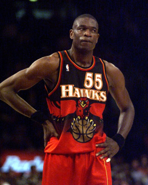
This is such a cluttered and in-your-face uniform. We should focus on the whole player as he moves around the court and performs for our entertainment, but when the uniform jumps out like this, it serves as a distraction.
You are noticing, by the way, how many of these uniforms swooped in (Hawks pun intended) during the 1990s, after the 1980s and their distinctly different approach to NBA uniforms…
Right? Right.
6 – WASHINGTON WIZARDS 2000s: ROAD

That this rec-league uniform is only sixth on the list gives you an indication of how bad 1-5 are.
5 – MINNESOTA TIMBERWOLVES 2000s: ROAD
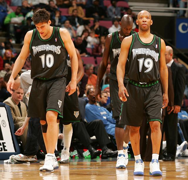
This isn’t Jurassic Park. (Hold that thought, too. You’ll see.) There is absolutely no reason for “Timberwolves” to be written with that font and all its flourishes. Complete unforced error on an easy volley into the open court.
4 – CHARLOTTE BOBCATS LATE 2000s: ROAD
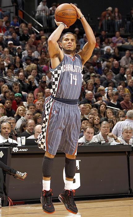
The checkerboard is meant to pay tribute to NASCAR? At least this wayward mishmash is drab, which paradoxically makes the uniform less offensive. (This is a cue to keep in mind for the No. 1 entry on the list.)
3 – CLEVELAND CAVALIERS LATE 1990s: ROAD AND HOME
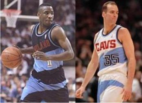
Slightly more aimless than the Charlotte uniform presented above in No. 4, only with more bright colors, which makes the whole look even more distracting and disorienting. Why did the Cavs have to mess with a simpler (1980s) uniform that worked? (Theme warning… WHOOP, WHOOP, WHOOP!)
2 – TORONTO RAPTORS LATE 1990s: HOME
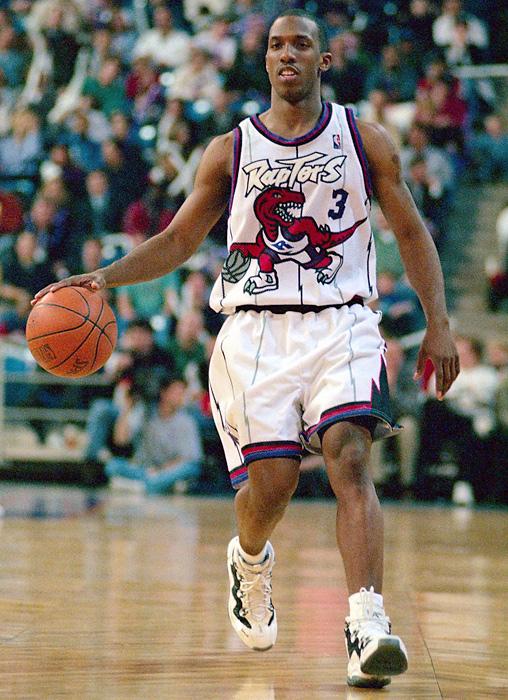
Easily the worst experience of Chauncey Billups’s career.
Jurassic Park on steroids, far worse than the Timberwolves above.
How do you mess up a white home uniform (even more than the late-1990s Cavs)? This is how you do it. Cartoon City USA — I mean, Canada.
1 – VANCOUVER GRIZZLIES LATE 1990s: ROAD
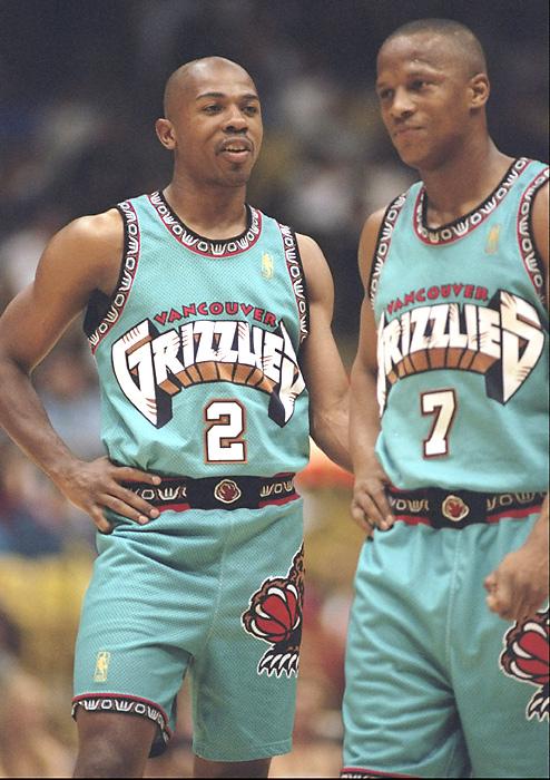
The Grizzlies tried to get fresh and colorful, and while the intent to avoid blacks or grays is noted, the results could not be more spectacularly awful than they are here.
Clutter, cartoonism, and loud colors in a complete eye-assaulting package — YOUR VANCOUVER GRIZZLIES.
This was grisly, all right. We hope you haven’t yet poked out your eyes.