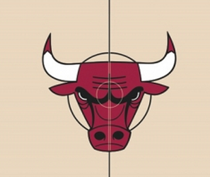
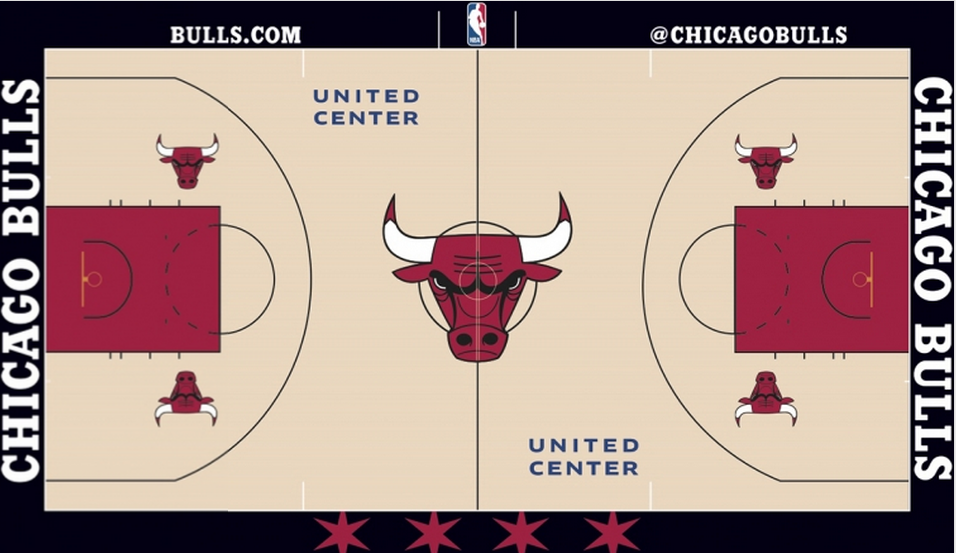
Here’s a look at the new court:
and some info from NBA.com:
The iconic bull head logo at center court has increased in size by 75 percent and the image of a basketball that was previously behind the logo has been removed. The “CHICAGO BULLS” text on the endlines has been changed to the font used in the official Bulls logo to make the court design more consistent with the Bulls brand, and the same font has been applied to the “Bulls.com” and the “@ChicagoBulls” text on the north apron of the court.
The lines on the court have been changed from red and white to all black to emphasize the bold colors of the Bulls brand.
The four stars from the City of Chicago flag have been added to the south apron of the court to highlight the team’s civic pride and incorporate the “Chicago Basketball” branding campaign.


