

I’m not a college football fan, but the avalanche of Twitter hate towards their uniforms was too much to ignore last night. So I fliipped over to the game and saw a uniform that seemed to be a grudging compromise between two designs. It’s the uniform equivalent of a mullet. Maybe Kevin Durant picked a bad time to get a huge “Maryland” tattoo.
Anyway, that got us to thinking about bad uniforms overall. And at the risk of turning this into some kind of “college football day” on an NBA site, we went back in time, pulled the ten ugliest NBA jerseys we could find, and put them all here so we could compare them against the affront to humanity we saw last night. Here they are, in no particular order.
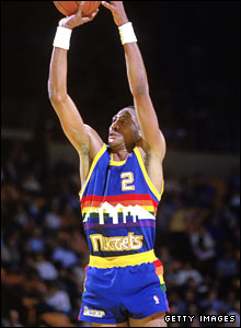 Denver Nuggets 1982-83 to 1992-93 road uniform
There were actually two versions with the same design. From 1983-1985, the Nuggets wore darker versions of the one Alex English is wearing in that photo. The Denver skyline framed by white mountains and a rainbow with “Nuggets” underneath to go along with rainbow accents down the side of the short shorts are as ugly as uniforms got in the NBA. This is the gold-standard of ugliness. I know it might be cool to say “those were awesome”… but they’re not. They’re only awesomely ugly.
Atlanta Hawks 1970-71 to 1971-72 alternate road uniform
 This kind of electric lime green can only be meant to blind defenders as Pistol Pete was leading the Hawks down the floor.
Honestly, what were the Hawks thinking with this? I can see the 70’s theme to the lines around the uniform. That was fairly common in that era. But… WOW… were these things an abomination.
Sacramento Kings 1994-95 to 1996-97 alternate road uniform
Much like the Maryland football uniforms, Sacto seemed to take the “let’s just sew two things together” approach for its alternate unis in the mid-90’s. Not only that, the Kings added some kind of checkerboard material down the sides to thoroughly confuse everyone.
I guess two-toned stuff was big in the mid-90’s. Then again, that’s when Kris Kross was trying to make wearing things backwards hot. Let’s just thank the deity of our choice that the NBA never latched on to that. Meanwhile, Mitch Ritchmond has to live with being the best photographic proof that the Kings’ uniform designers lost their damn minds in the mid-90’s. Sorry Mitch, you deserve a much better fate:

 Cleveland Cavaliers 1994-95 to 1996-97 home and road uniforms
White at home and black on the road, both sets of uniforms featured a hideous blue sash across the uniform top and the shorts as well as blue trim around the neck and arms of the jersey.
As you’re about to see, The NBA really had a bad stretch in the mid-90’s. There were poor choices all around. The Cavaliers have been a uniform-happy team, with about a dozen or so different variations of home/road combinations and alternate jerseys. I guess if you’re going to try that many jerseys, one of them will be a “miss”. And this was it. There were certainly others, but this one just stands out.
 Philadelphia 76’ers 1991-92 to 1993-94 home and road uniforms
This is a classic case of a team unnecessarily tinkering with a classic. This Sixers were one of those teams with elegantly simple uniforms, and then they had to go and mess it up with this monstrosity.
Philly has a unique name which celebrates its unique place in American history. On July 4, 1776, our founding fathers gathered in Philadelphia to sign the Declaration of Independence. The 76’ers misguided attempt to mix a “contemporary” style with the symbols of American independence (the stars, the red white and blue, the launching of the logo into the jersey like fireworks) just come off as a jumbled mess. This thing looks like a cheap soda can.
And as you can see with all of these, everyone realized it was a mistake pretty quickly. These uniforms only lasted three years, but that’s three years too many in my book.
 Detroit Pistons 1995-96 to 2000-2001 home and road uniforms
Man, teal was a big color back in the day. A big mistake of a color that is.
The Pistons, like Philly, messed with a wonderfully understated uniform to create that… thing. The hideous logo and the attempt to capitalize on teal’s popularity led a wicked mistake that was thrust upon the fans of the Pistons for five long years.
Those uniforms marred Grant Hill’s career in Detroit. And I’m telling you that Grant Hill’s injuries while in Detroit were 100% caused by his body rebelling against being forced to wear that disgusting outfit. The CIA would do well to ditch the water-boarding of terror suspects and just force them to walk around in these uniforms. They’ll talk after that. Oh… they’ll talk.
Utah Jazz 1996-97 to 2003-04 home and road uniforms
Another mid-90’s disaster.
The Jazz took their name in 1974 when they were the New Orleans Jazz. That name made sense for a team from New Orleans, but it makes ZERO sense for a team in Utah. Yet, the team kept the name. But in the 90’s, in the midst of all this uniform-redesign craziness, the Jazz seemed to try to distance themselves from the musical connotations of their past.
The result was a purple uniform with jagged white mountains and the word “Jazz” seemingly streaking across. It was a terrible choice that didn’t last too long, even though it lasted too long. Just look at the looks of enthusiasm on Karl Malone and John Stockton’s faces as they, presumably, look in the mirror.
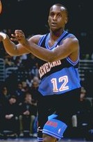
 Washington Wizards 2006-07 to 2008-09 alternate uniform
To be honest, I have no idea where this color combination came from. Take a closer look. Black, white and gold with stars down the sides. It just makes no sense. There’s no nod to history with this alternate jersey, there’s no play on the color scheme, and there’s no real excuse for it to even exist.
With that, I can think of no better fate for this jersey than to be forever linked to Gilbert Arenas. Both are stains in Wizards history, and both would probably be wiped from our memories if the fails weren’t as epic as they were.
Unless the “Men In Black” flashy thingy is actually invented, the image of Gil in that hideous garment shall forever be etched in our memories.
(Note to scientists: invent the flashy thingy. Thanks)
 Atlanta Hawks 1995-96 to 1998-99 home and road uniforms
At this point, I’m applauding the teams that resisted the urge to change in the mid-90’s. I shudder to think what a Celtics or Knicks uniform might have looked like if they succumbed.
Anyway, the Hawks are another team that has tinkered with its look. 11 different home/road combinations and four other alternates make it easy to understand why this is Atlanta’s second appearance on this list. They could have others, too, but I’m being nice.
There’s nothing nice, however, about forcing your team to wear this red-to-black gradient with a hawk so huge that its wings damn near touch on a the player’s back. Road jerseys are usually much worse than the home jerseys because the home jerseys are usually white, and the white background gives designers less room to screw things up.
This is one of those screw ups, which is why they were dumped after just three seasons.

Houston Rockets 1995-96 to 2002-03 home and road uniforms
Poor Charles Barkley. He’s modeling two of the worst ever NBA uniforms. That’s what happens when you get traded in the middle of the NBA’s uniform “dark ages.”
The Chuck Wagon got to Houston in time to wear this insane looking thing. The rocket was designed to mimic the faces drawn on World War II “Flying Tiger” fighter jets, and it’s circling a basketball globe. And like all the other whiffs from this era, this look completely abandoned past color schemes. It’s the only blue road jersey the Rockets have ever worn. And while I understand that you’re in Houston, a city synonymous with the space program, but this is one that made everyone say “Houston, we have a problem” (Sorry… I couldn’t resist that one).
After seven years, the Rockets went back to a much simpler design of both the uniforms and the logo. Not soon enough, though.
So as you can see, the NBA can certainly challenge The Maryland Terrapins and their hideous football jerseys. Now pardon me as I consult my attorney to see if I can sue for the pain and suffering I was caused by taking this assignment. The headache caused by looking at all these uniforms may never go away.
Photos: Getty Images, BestSportsPhotos.com, Paplaci.hu